Office Max Rebrand
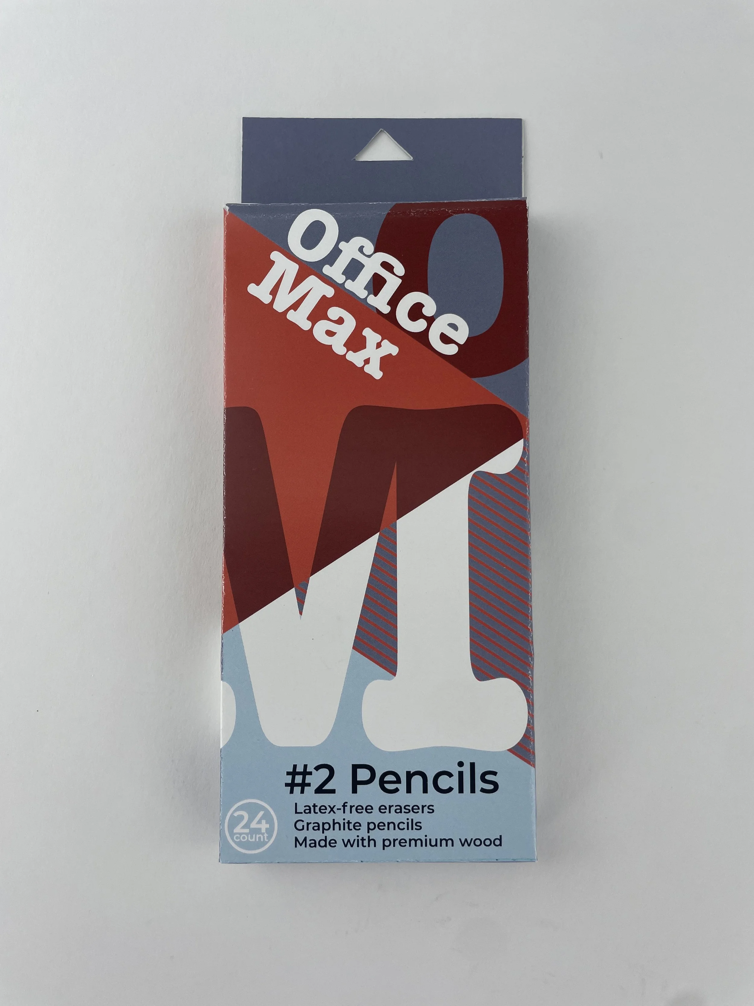
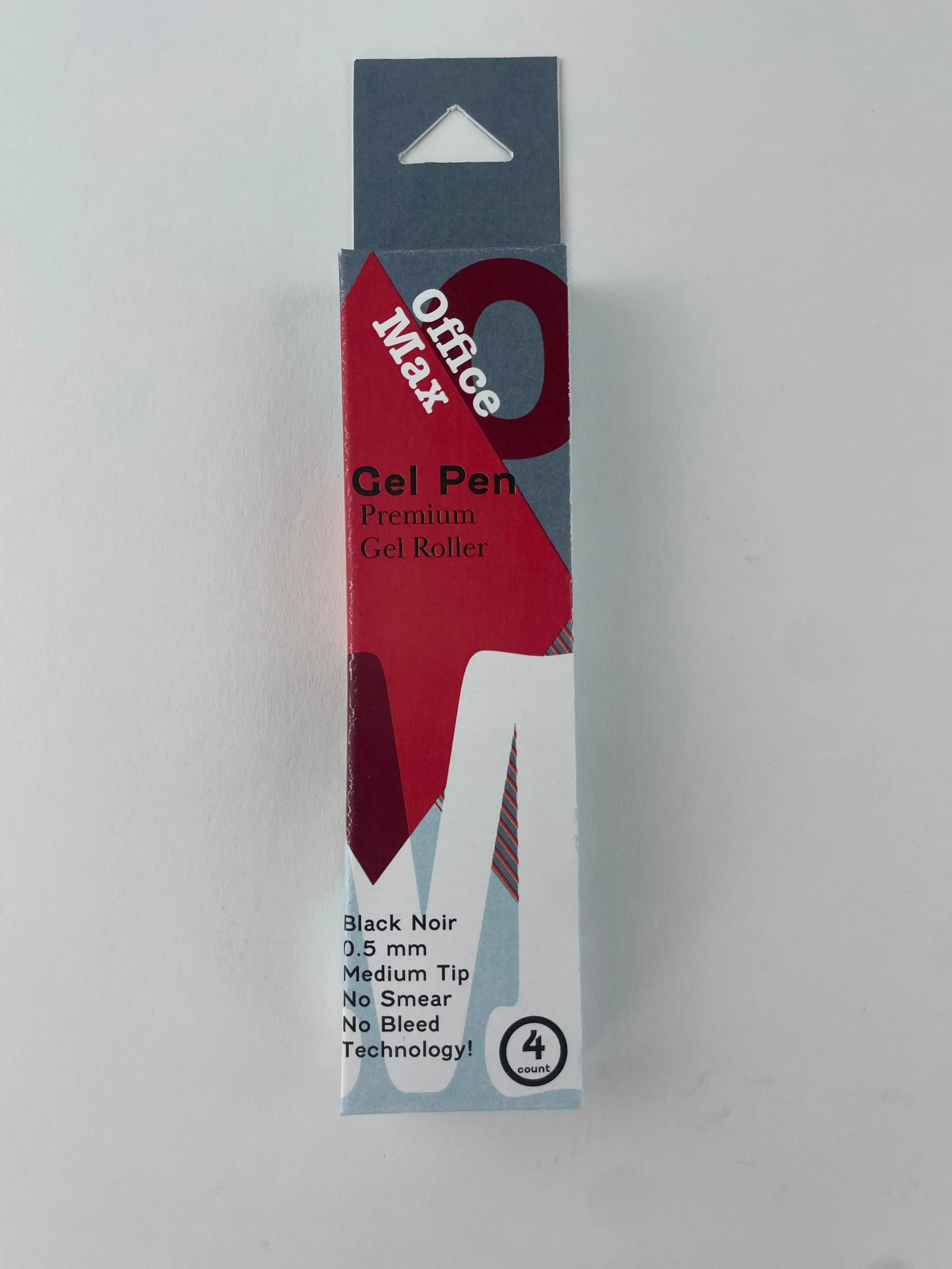
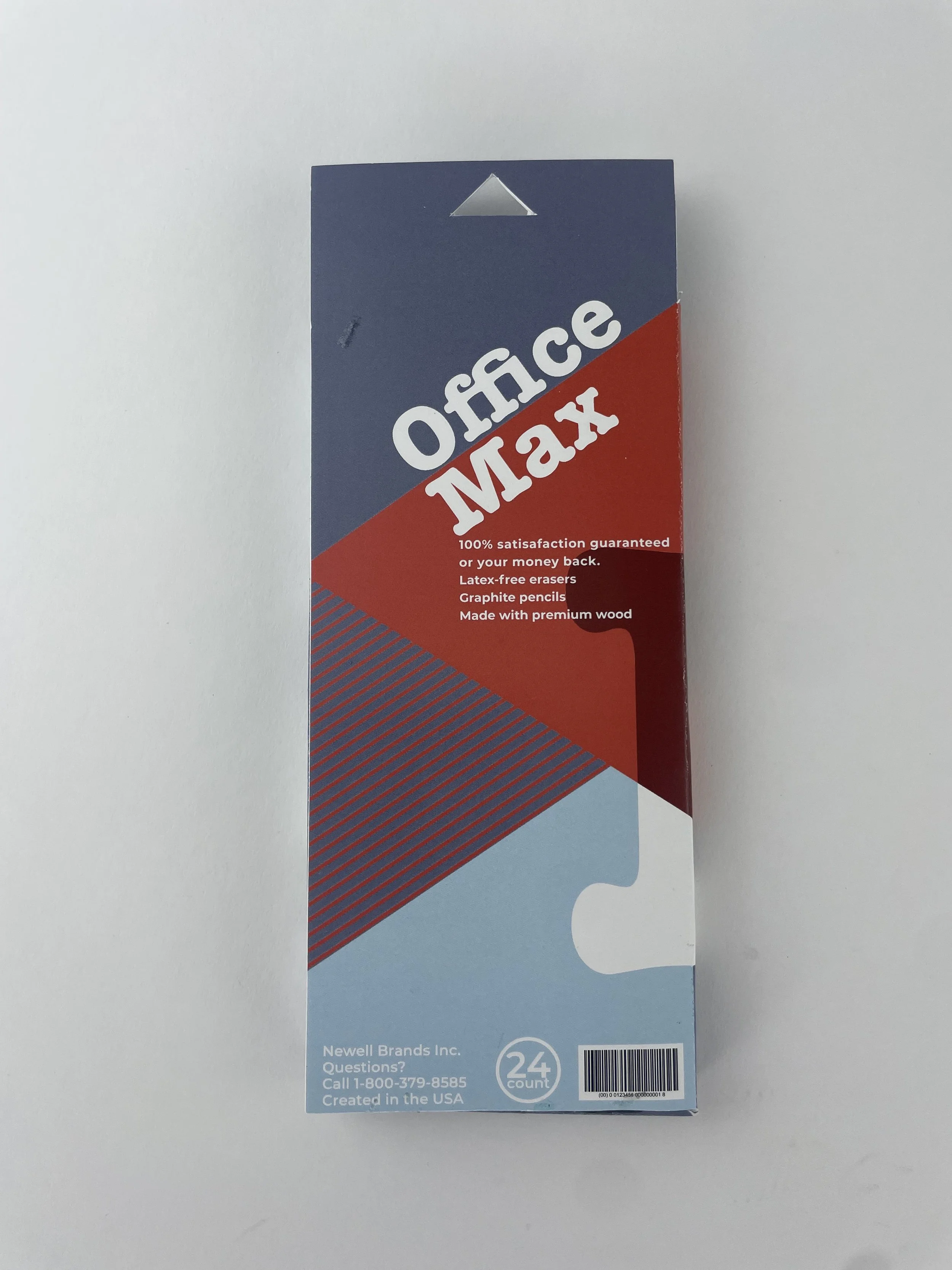
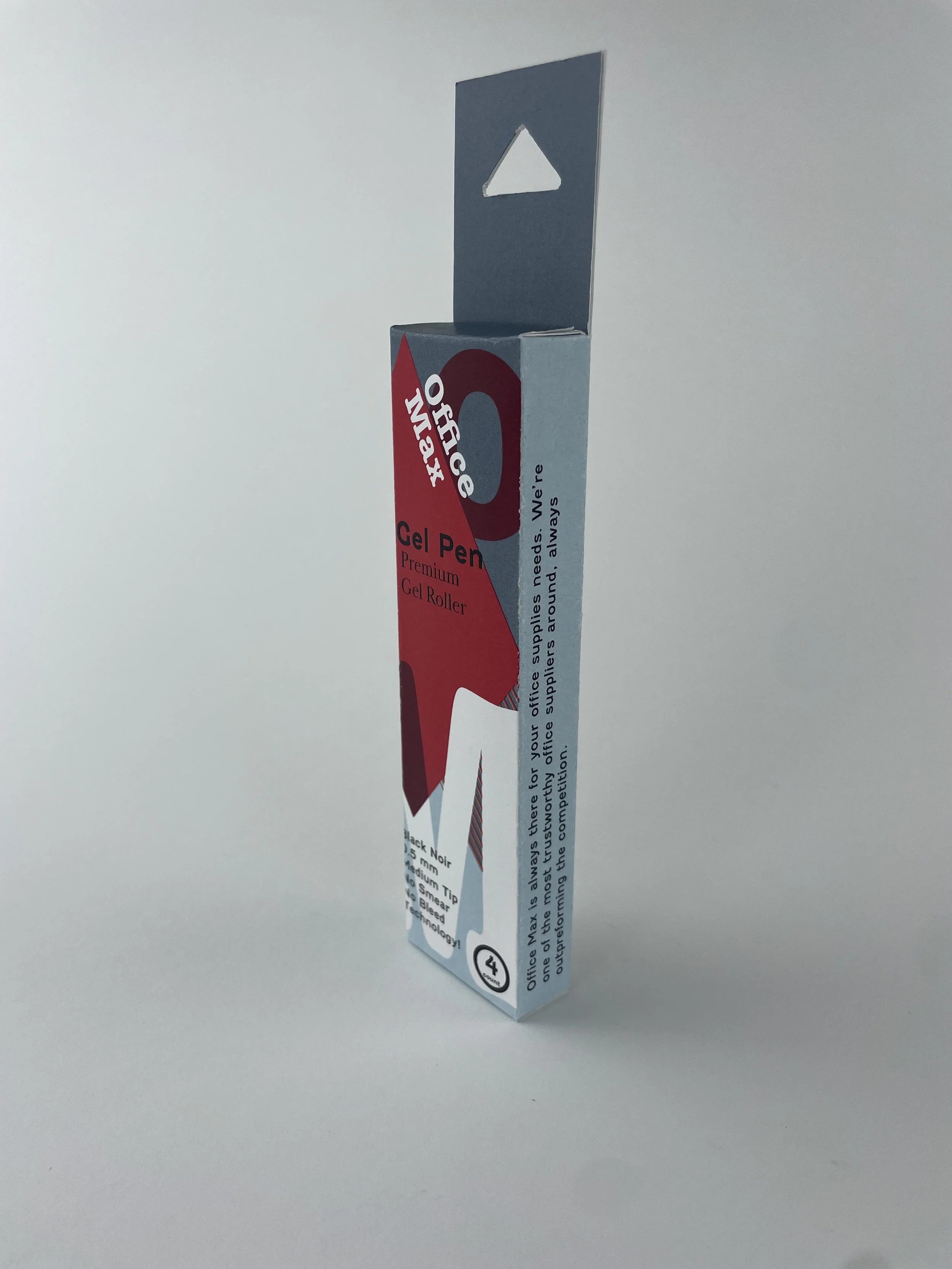
For this project I recreated Office Max packaging for their store products. I used the first letters of both office and max and used that to be integrated in the design. I reused the Office Max red and then use different shades and a complimentary blue with a dark grey background to create an eye pleasing color scheme for the packaging. Using basic shapes like diamonds and repeating lines add a minimal aesthetic that draws more attention to the large “O” and “M”, especially where the “M” transitions to a dark red when overlapping the diamond on the box.


